2019 was the centennial of the Jallianwala Bagh Massacre. It took place on 13th April 1919 on the day of a religious holiday Vaisakhi, with 50 fully armed infantry commanded by Brigadier-General Reginald Dyer, who were ordered to open fire 1650 bullets in a crowd of around 20,000 people, killing children, women and men going about their daily lives, in under 10 minutes. There was furious debate in the news where Britain was contemplating formally apologizing for the latter event, but decided not to. My interest in this event/case study/patient zero was not due to the atrocious spectacle of colonial violence nor the continued negligence of the British to take any responsibility 100 years later, but because it is the perfect allegory to how history is rooted in misinformation. The tension in statistics accumulated by the Indian Congress, the party that got India freedom in 1947, and the British official report reflects this analogy.
As researched by Kim Wagner in ‘Amritsar 1919’, the reports of the two parties are hugely disproportionate. The British official numbers say that there was a crowd of 6000 people, where the causality was around 1200, in which 379 died and three times that were injured. However, the Indian Congress reported there were 20,000 people in the crowd, where the causality was over 2500, in which 1000 died and more than 1500 were injured. The only ‘fact’ seems to be the 10 minutes that the firing happened in where based on that, 1650 rounds were fired.
It is obvious that the Indian numbers are fleshy, whilst the British shy. Thus to graphically represent this information as a historical record would clearly be a challenge. By choosing one statistic over the other, is to make a political statement by giving weight to a single perspective of history over the other. This kind of duality, or dichotomy of information is something that is permanently present in every event, historical or present. The question comes down to how to filter this information to find the ‘truth’? Here in applies my argument: in this age of post-truth, and fake news, there is no such thing as the ultimate ‘truth’. ‘Truth’ specially in terms of history can be considered as a one-sided story by a single person or group of people on-looking an event. There is no way for there to be one ‘truth’ for everybody since our cultural, social, economic, geographic, historic and racial heritages differ vastly from each other. Attempting to a) find the ‘truth’ b) graphically represent the ‘truth’ is similar to believing in and acting upon ‘neutrality’ and ‘universality’, idealistic concepts that cannot exist in reality. So why try? Instead accept that all data/information/facts/truths are humanly flawed and design accordingly.
What a (mis)infographic suggests is to take all the various sources of information, in this case the two separate statistics, and design by keeping them both plainly in front of the audience’s eye. In this way you are showing the tension, but you are also teaching the audience to gage into all kinds of information on their own. To question what they are receiving. The visual or text should teach them how to think, not what to think.
Keeping in mind all these aspects, I designed the (mis)infographic for Jallianwala Bagh massacre.

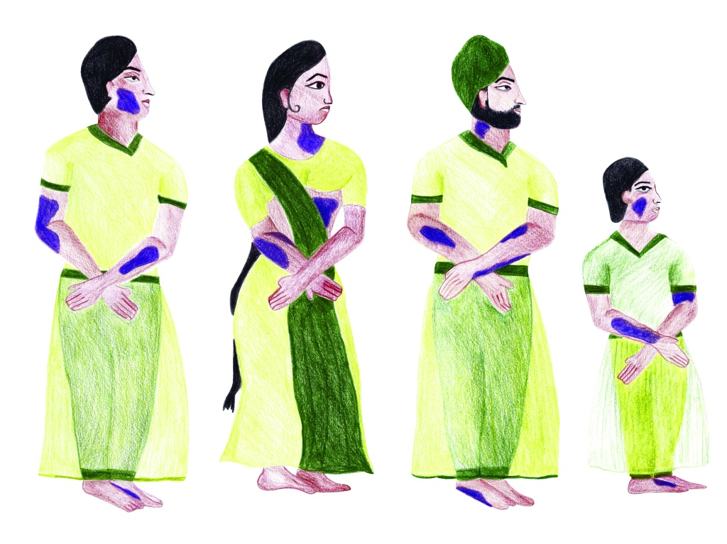
The diagrams are meant to be displayed next to each other like done above, however, due to size considerations on the internet, I have included larger versions of each below for details. The (mis)infographic houses figures in indigo that represent the people that were killed, green for people that were injured and yellow for people that happened to be present in Jallianwala Bagh on 13th April 1919. Each figure represents 100 people. The left diagram is based on the statistics of the British official report- Killed: 379, Injured: 1200, Total Crowd Present: 6000. In contrast, on the right there is the Indian Congress Report- Killed: 1000, Injured: 1500, Total Crowd Present: 20,000. The (mis)infographic is trying to show the tension in information without trying to be reductive or conclusive. It is not my place to weigh into either report; I am just trying to illustrate both statistics side by side to allow the audience to gage the discrepancy in historical accounts.


Each category of figures has four variations, almost accurate to the demographic of the crowd present. This was done in stark contrast to Otto Neurath’s depiction of the Great War (see my dissertation, Stories of the Colonized: No More Through the Lens and Data of the Colonizer), where the figures were flat and lifeless. The colour indigo represents justice and dignity, something the people who were mercilessly killed that day were not offered. In painting those figures in that colour I hope to honour their souls with the rights their bodies weren’t given. Green symbolizes renewal and health, which is what I salute the injured civilians with. The people in the crowd are wearing yellow because 13th April 1919 was Vaisakhi, also known as Punjabi New Year. A religious holiday where Sikhs wear yellow to celebrate. Also one of the main reasons why people were present in the square in large crowds.


As every story is seen from multiple perspectives, in order to record it in history the accumulation of those stories is crucial. The cross between the varying perspectives is the exact point in which history actually lies, and the viewer needs to be trained to take all of it in before deciding whose account is more or less valid. By beginning to include all perspectives of an account we will begin to decolonize our history, and when that data is visually represented will we go on to decolonize the way in which it is presented (designed).

One thought on “Patient Zero”